
Explore Japan is a mobile-first travel app unifying discovery, cultural context, and simple trip planning. With guest access and location-aware suggestions, travelers decide faster and experience Japan more deeply.
Project: Mobile app to help visitors explore Japan and understand local culture
Deliverables: Research plan, interviews & survey synthesis, flows, wireframes, visual system, onboarding and core feature screens
Role: End-to-end Product Designer (research → IA → interaction → UI)
Platforms: iOS/Android (mobile-first)
Japan travel planning is fragmented across blogs, maps, booking sites, and social feeds. Travelers want up-to-date, location-aware guidance that goes beyond “top 10s” to include culture, etiquette, events, and local deals without juggling multiple apps. The goal: a simple, navigable app that curates places, context, and planning tools in one place.
Young, tech-forward travelers aged 18–40 who love discovery and adventure (hidden spots, local activities, cultural immersion). They need fast, on-the-go decisions and light planning support, not heavy itineraries.
Interviews: ~20 travelers across styles (solo, friends, couple).
Survey: ~20+ responses on habits, booking behavior, planning depth, comfort with maps and transit.
Key insights:
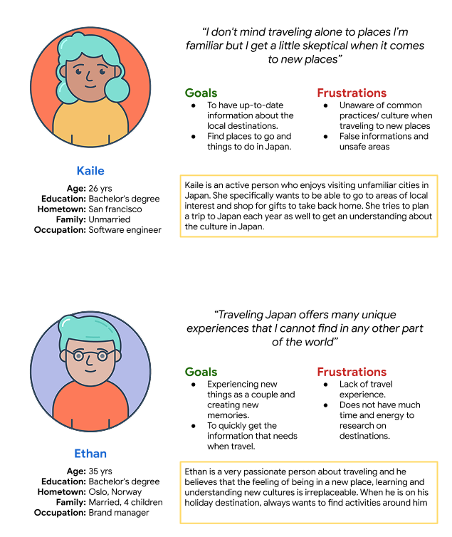
There’s no single, reliable place to find Japan-specific, real-time travel info (what’s near me, what to do now, how to understand what I’m seeing) while also planning simple multi-stop trips. The experience must be fast, trustworthy, and culturally informative.
Mobile-first clarity: thumb-friendly, readable, minimal friction.
Local relevance: location-aware surfaces (nearby, open now, events).
Narrative context: culture, etiquette, and “how to experience” guidance beside listings.
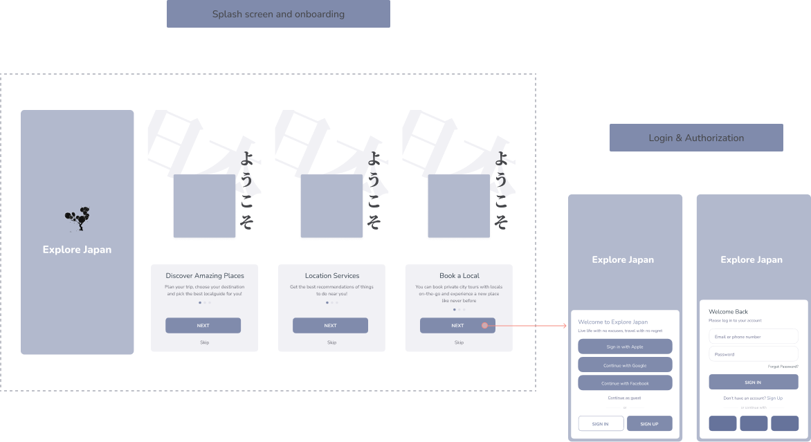
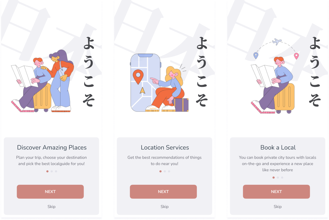
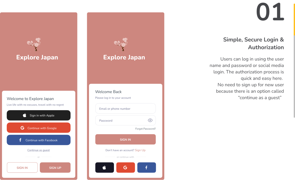
Progressive commitment: explore as guest; upgrade to account later.
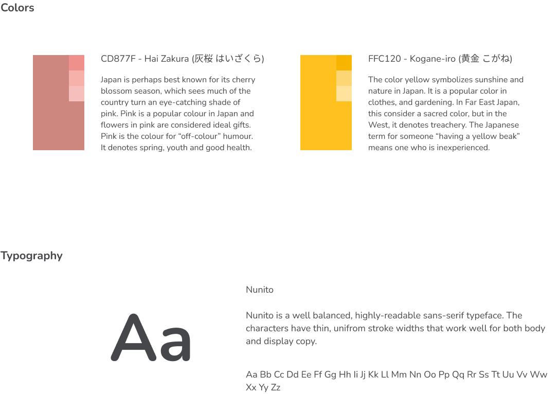
Minimalism: strong hierarchy, generous spacing, type-led design.
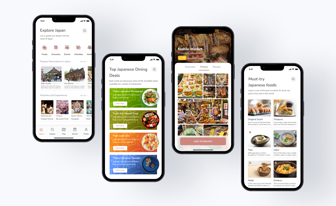
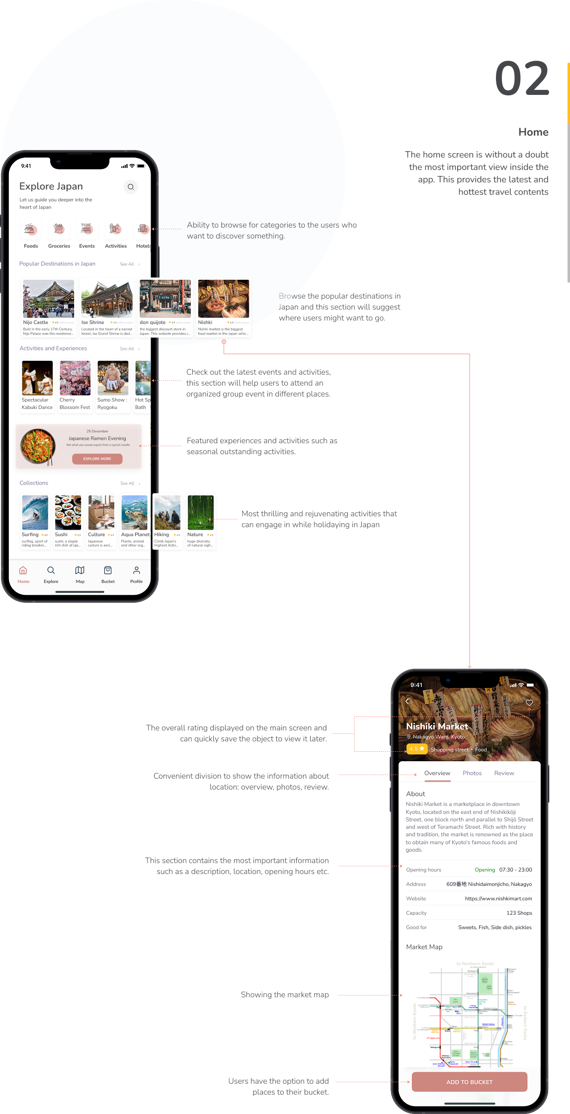
Home (What’s hot now): popular destinations, timely activities, seasonal highlights.
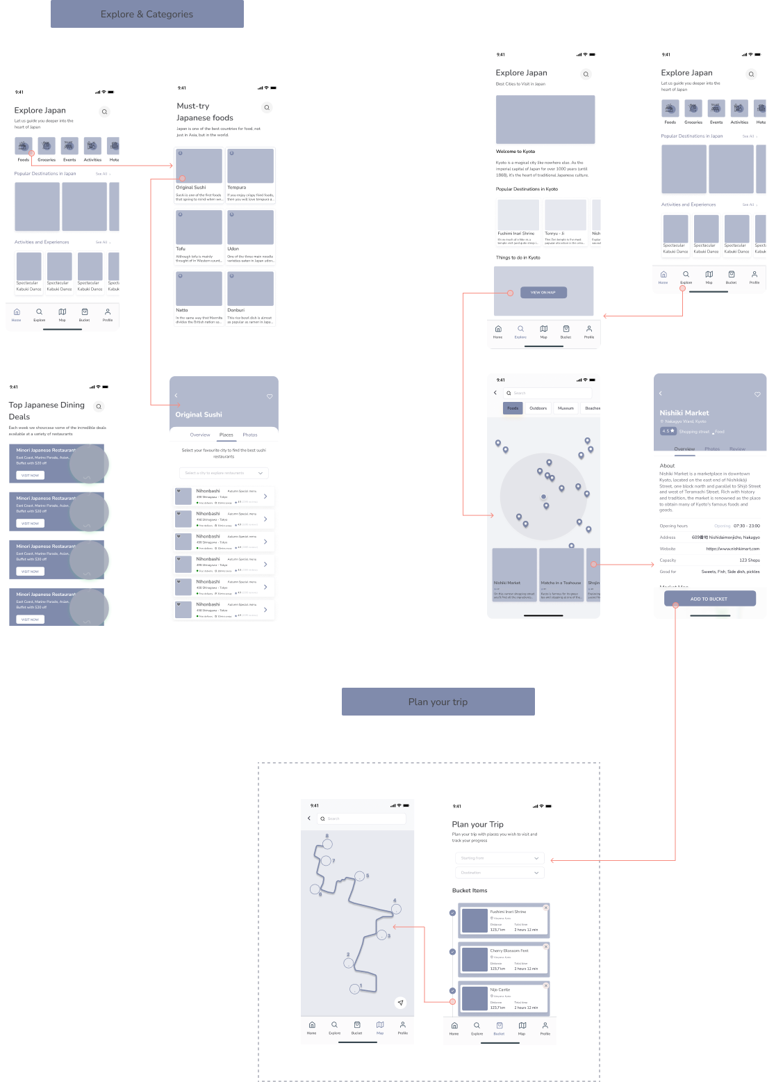
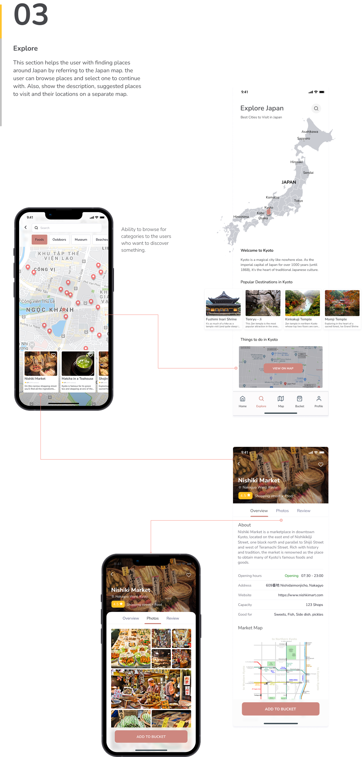
Explore (Browse/Discover): categories (Food, Outdoors, Museums, Beaches), editorial collections.
Place Details: overview → photos → reviews; practicals (hours, address, map, “good for”).
Bucket (Save): add places to a shortlist for later.
Plan Trip: start & end points, add saved places, see distance/time, and manage the route.
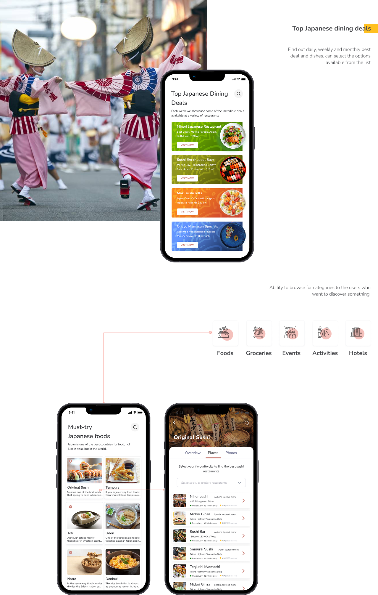
Deals & Dining: weekly top dining deals and “must-try foods” with city filters.
Delivered in just four weeks, the Brandr dashboard redesign demonstrated fast, disciplined execution despite back-end constraints.
We leaned on a user-centered process with four focused workshops to align on goals, surface limitations, and translate stakeholder insights into a clear information architecture and interaction model.
In the final workshop, we proposed a dual-track solution: an ideal, unconstrained vision and a widget constrained UI that works within today’s stack while paving a path to the future.
This approach let us ship confidently now without sacrificing ambition later. The result is a powerful, intuitive brand-analysis experience that mirrors the clarity of Brandr’s reports while adding in-product context, drill-downs, and comparisons enabling faster, more defensible decisions.
The redesign meets Brandr’s near-term objectives, exceeds expectations on usability, and establishes a solid foundation for upcoming enhancements, including AI-assisted narratives and deeper benchmarking.