
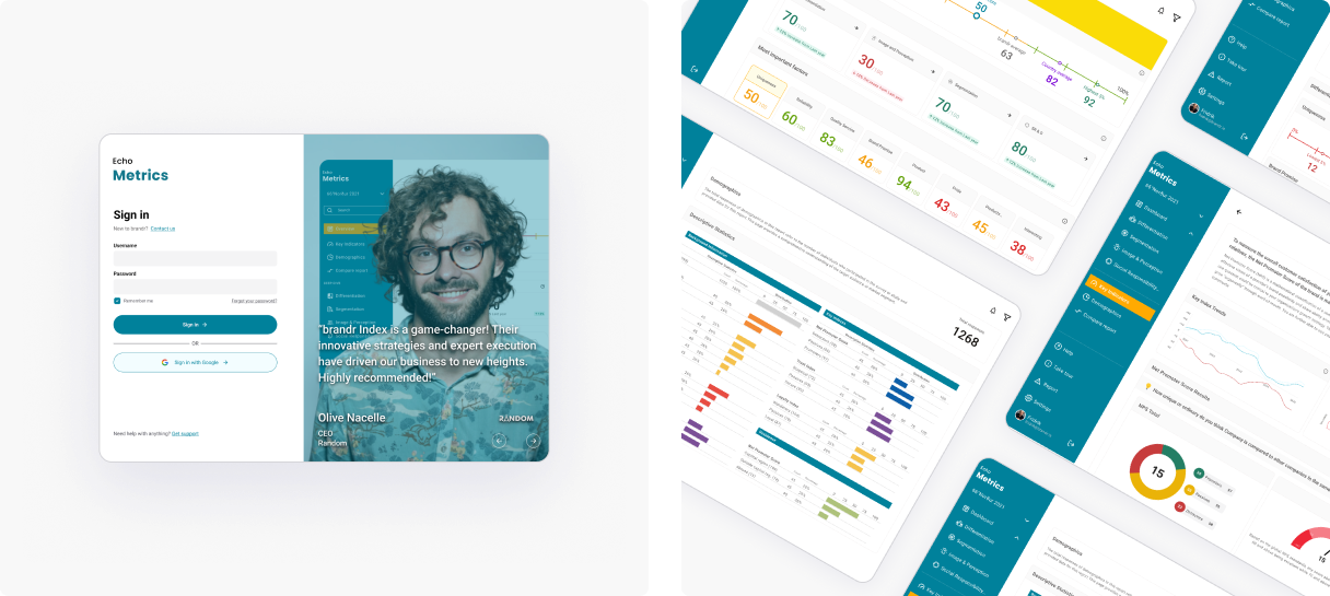
In four weeks, we transformed EchoMetrics’ PDF insights into a live, executive-ready analytics portal—preserving narrative clarity while adding drill-downs, comparisons, and guided onboarding—so leaders can understand, trust, and act on brand performance faster.
Client: EchoMetrics (brand performance analytics)
Sector: MarTech / Brand Analytics
Engagement: 4 weeks, end-to-end UX/UI redesign (workshops → IA → wireframes → hi-fi → handoff)
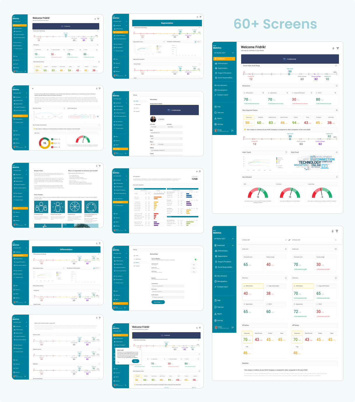
Deliverables: 60+ responsive screens, component library, interaction specs
My Role: Product Designer (research facilitation, IA, interaction design, design system, prototyping)
Core Tools: Figma, FigJam (workshops), Loom/Walkthroughs, Jira/Confluence (handoff)
EchoMetrics is a leader in brand performance insights. Their online portal lagged behind the quality of the PDF report delivered to customers: navigation was confusing and valuable signals were hard to extract, while the static PDF was clear, visually compelling, and rich in analysis. EchoMetrics asked us to redesign the dashboard so the live product delivers the same clarity and narrative strength as the report.
Usability gaps: hard to navigate; insights buried.
Experience mismatch: the PDF report outperformed the portal in clarity and depth.
Make it effortless to read, compare, and act on brand scores.
Translate the PDF’s visual narrative into an interactive UI while keeping content and design consistent across media.
Primary users are senior brand stakeholders at client companies—CEOs, CMOs, and Brand Managers—who need quick, defensible insights and drill-downs.
Long-term vision: evolve into a SaaS platform with AI-assisted analysis and predictive capabilities.
Near-term constraints: portions of the backend and widget framework limited certain visualizations; we proposed two design pathways—an ideal unconstrained UI and a widget-constrained UI compatible with the current stack.
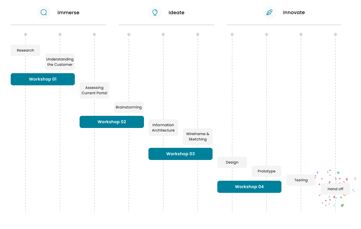
We followed a four-workshop cadence to align, audit, structure, and decide:
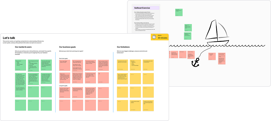
Ice-breaker to build rapport; then “Let’s Talk about Brandr,” a sailboard (wind/anchors) exercise to surface goals, limitations, accelerators, and blockers. Outcomes: user roles clarified, business goals aligned, and a north-star narrative for how scores should “tell a story.”
Key insights: target users, PDF-to-product narrative parity as a primary goal, and a roadmap toward AI-enabled insights.
Heuristic review and stakeholder interviews to identify pain points and preferences; aligned redesign priorities to expectations.
Restructured the information architecture to mirror how executives read the PDF: top-level brand health → diagnostic drill-downs → segment/period comparisons.
Presented two options:
Best-possible UI (no technical limits), and
Widget-constrained UI that works now and can be upgraded later—chosen to de-risk delivery while keeping a path to the ideal design.
We mapped content to decision moments:
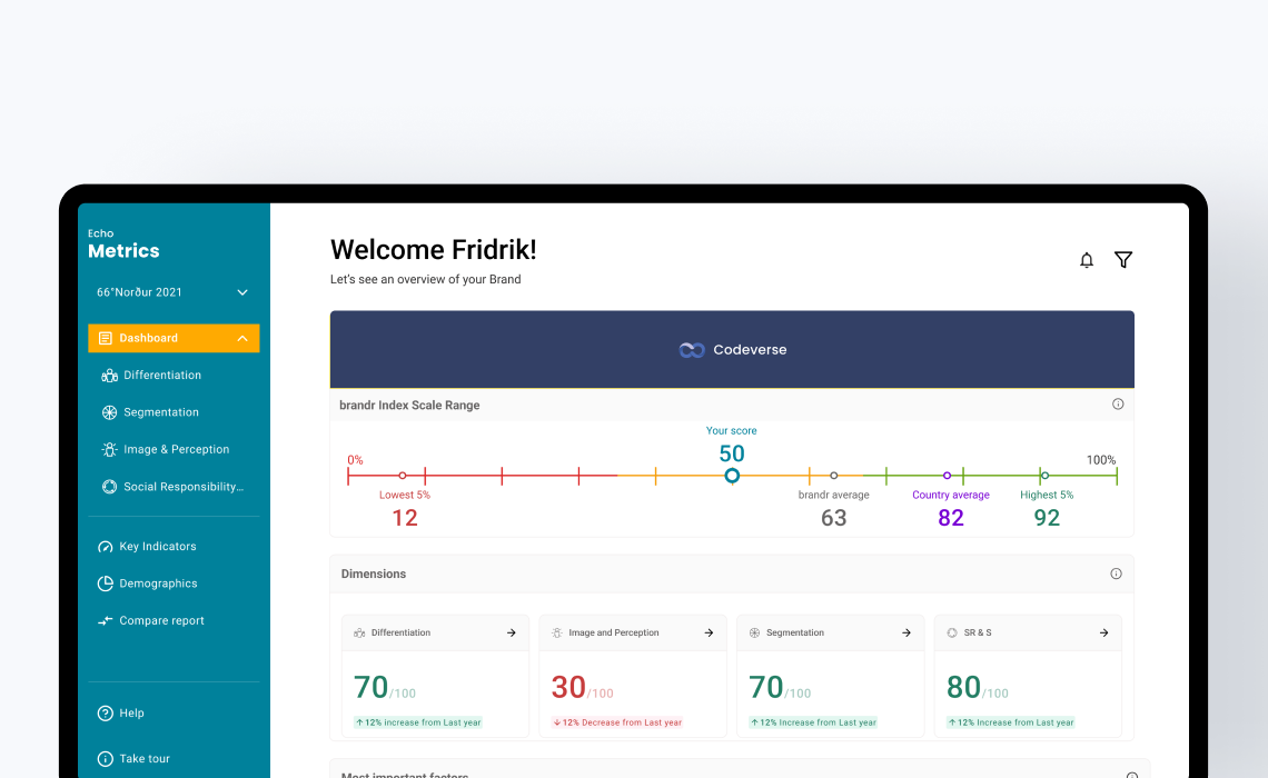
At-a-glance: overall brand score, movement vs. prior period, confidence signals.
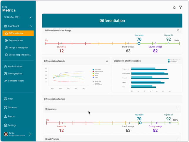
Explainability: what’s driving the score (factors, weights, benchmarks).
Comparison: YoY/period comparisons and cohort benchmarks.
Validation: drill-downs with definitions, methodology, and notes (replacing “hunt in PDF” with in-context help).
This IA directly addresses the original clarity and navigation issues and mirrors the PDF’s narrative flow.
Each widget includes an info icon. Clicking flips the card to show definitions, methodology, and “how to read” tips—keeping the main surface clean while making depth one click away.
Why it matters: Executives can trust what they see (context + definitions) without switching artifacts.

A dedicated expand affordance opens an in-place breakdown: sub-scores, drivers, and factor weights. Users get a granular view without losing context.
Why it matters: Shortens the path from question (“why did this drop?”) to answer (driver X fell by Y%).
Pick two periods to compare key metrics side-by-side, highlighting variance and trend. Ideal for QBRs and board reviews.
Why it matters: Frames the conversation on change over time, not just single points.

A built-in, first-use guided tour to reduce cognitive load and ensure immediate value realization.
Why it matters: Cuts training overhead and improves first-week adoption.
Score storytelling: consistent color/scale conventions, variance badges, and contextual labels for immediate read-outs.
Layout rhythm: predictable card grid; primary KPIs above the fold; details on demand (flip/expand).
Executive readability: restrained typography, large targets, and accessible contrast standards.
Scope: 60+ screens, responsive variants, micro-interaction specs, and a component library aligned to current widget constraints.
Handoff: annotated prototypes + tickets aligning UX intents with engineering constraints.
Delivered in just four weeks, the Brandr dashboard redesign demonstrated fast, disciplined execution despite back-end constraints.
We leaned on a user-centered process with four focused workshops to align on goals, surface limitations, and translate stakeholder insights into a clear information architecture and interaction model.
In the final workshop, we proposed a dual-track solution: an ideal, unconstrained vision and a widget constrained UI that works within today’s stack while paving a path to the future.
This approach let us ship confidently now without sacrificing ambition later. The result is a powerful, intuitive brand-analysis experience that mirrors the clarity of Brandr’s reports while adding in-product context, drill-downs, and comparisons enabling faster, more defensible decisions.
The redesign meets Brandr’s near-term objectives, exceeds expectations on usability, and establishes a solid foundation for upcoming enhancements, including AI-assisted narratives and deeper benchmarking.